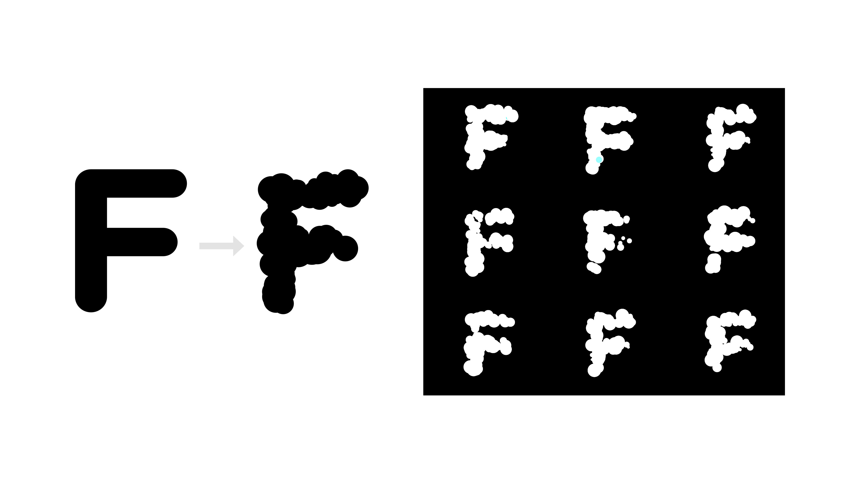
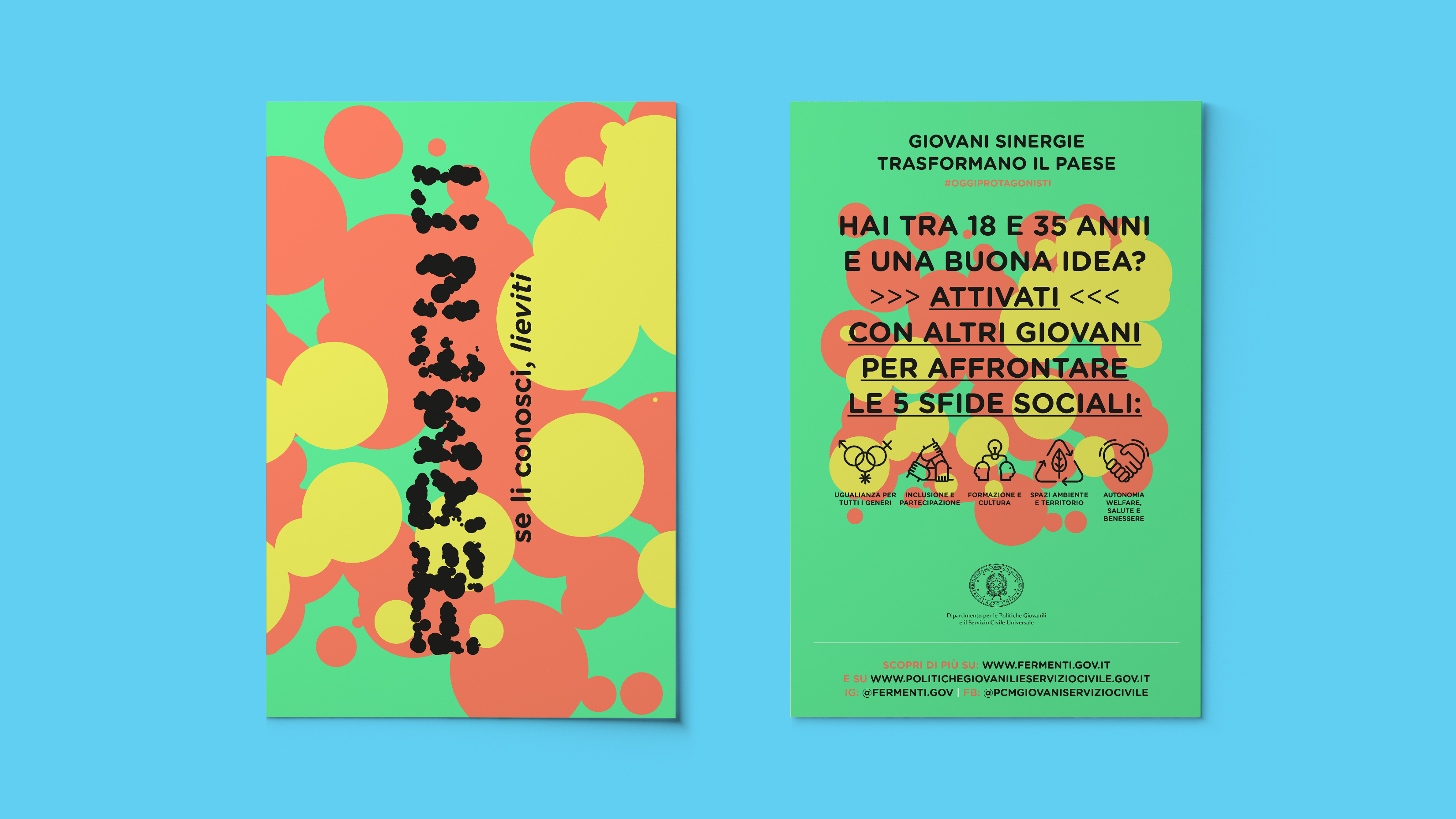
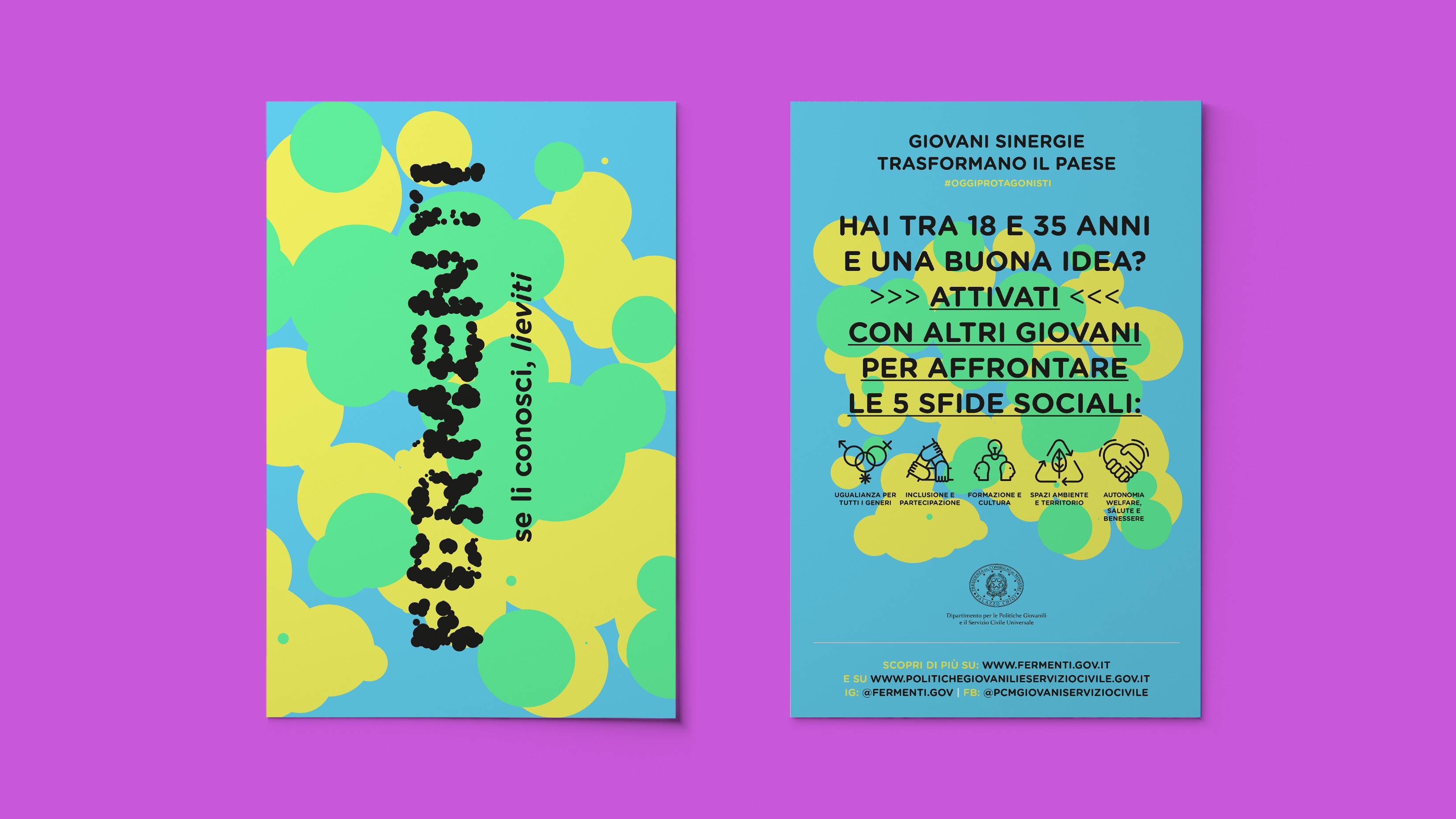
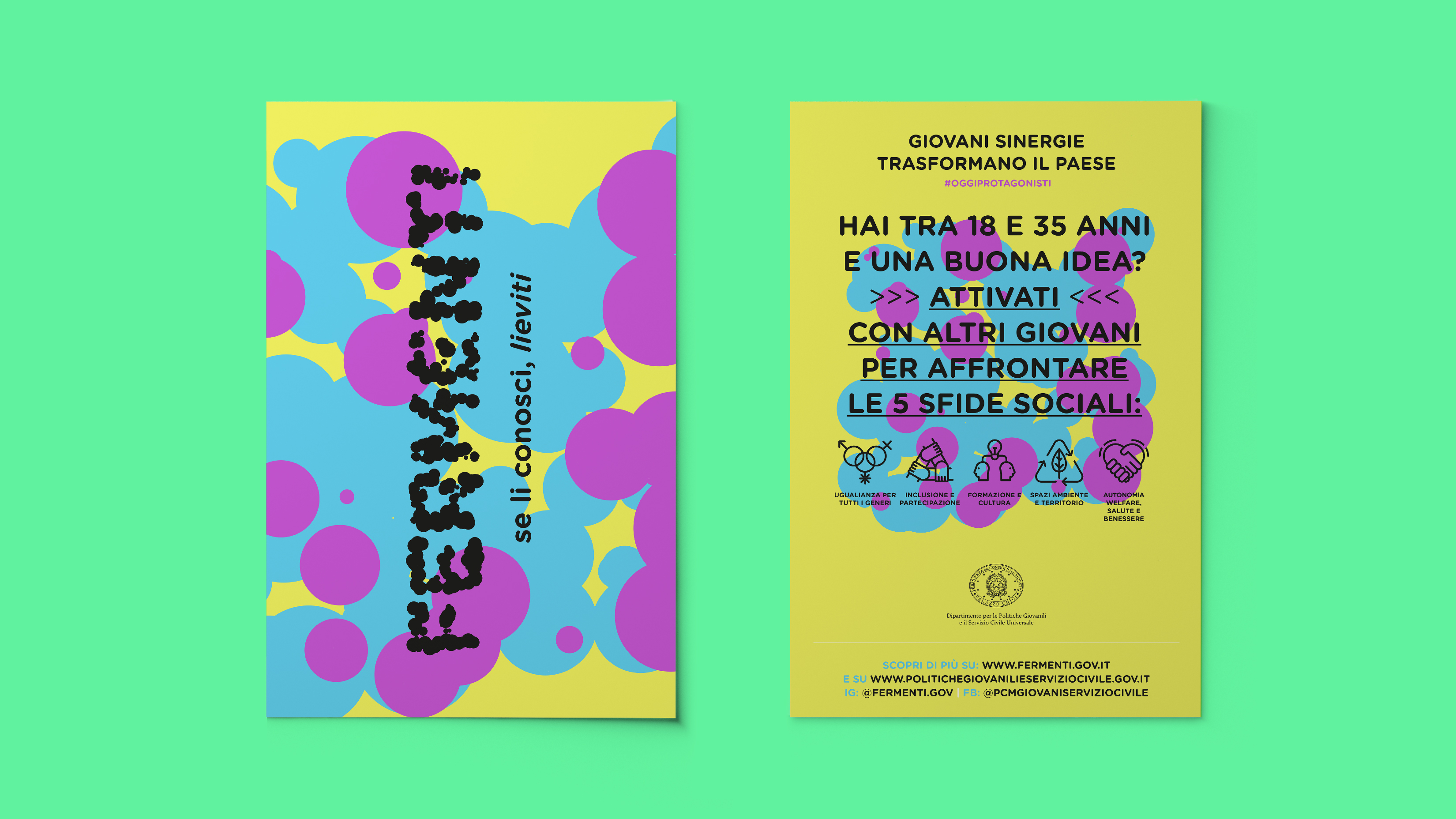
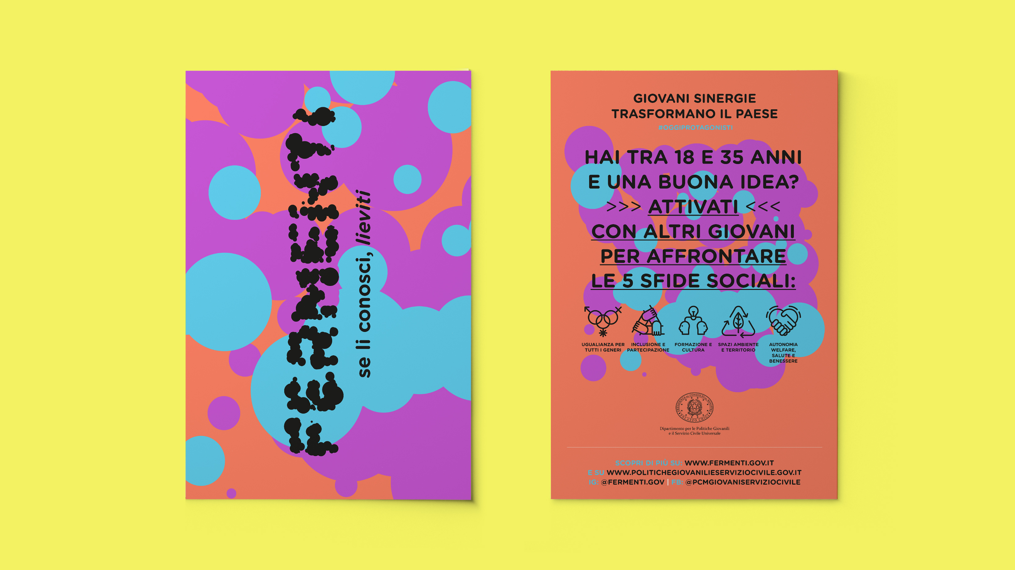
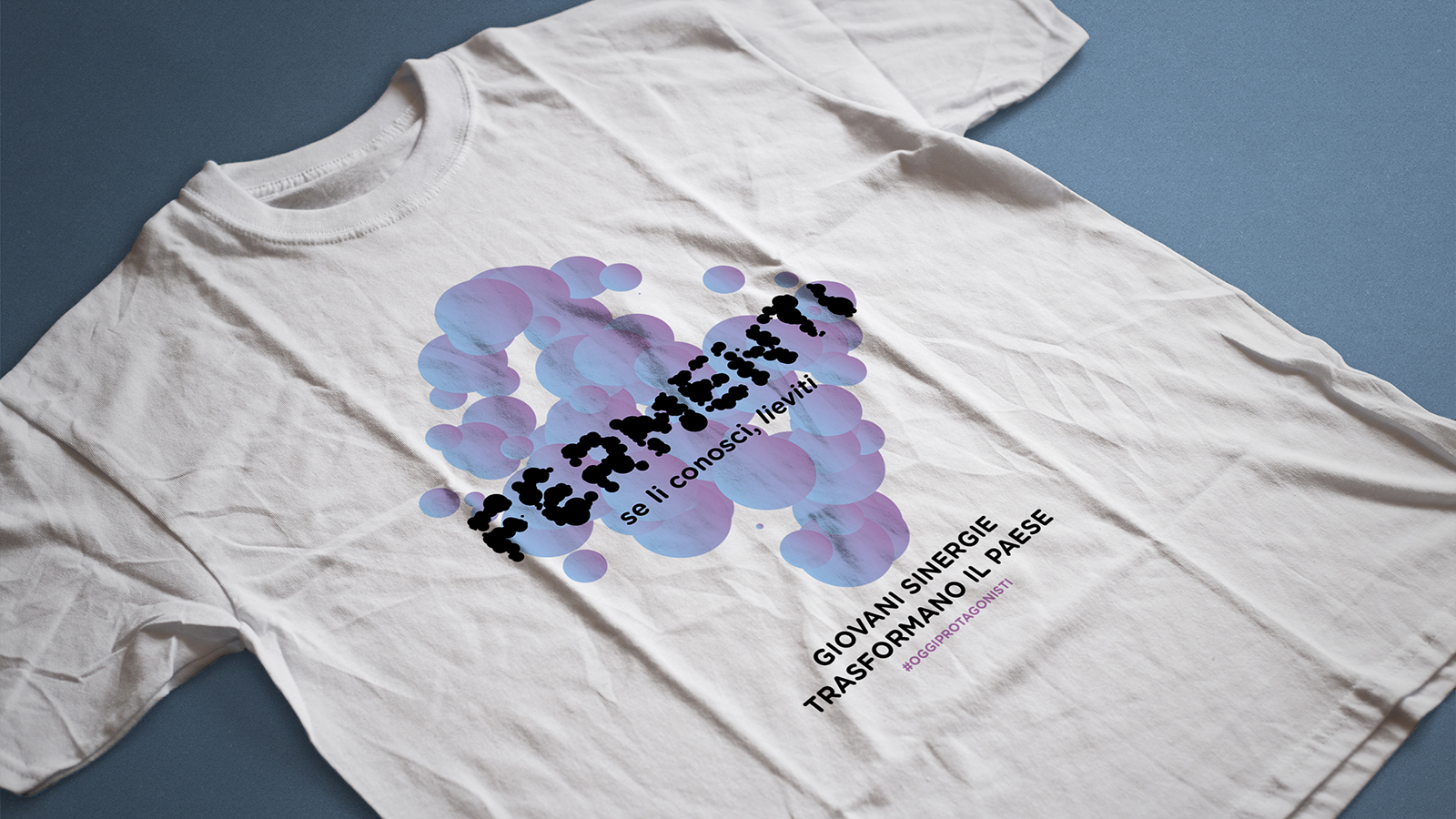
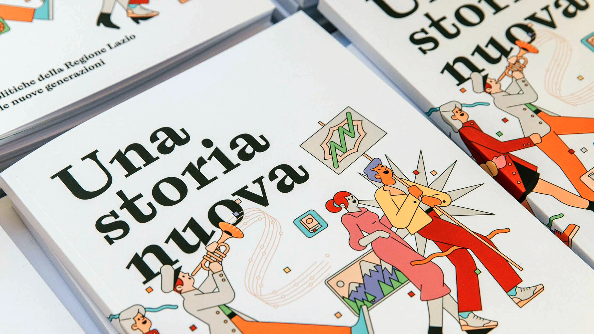
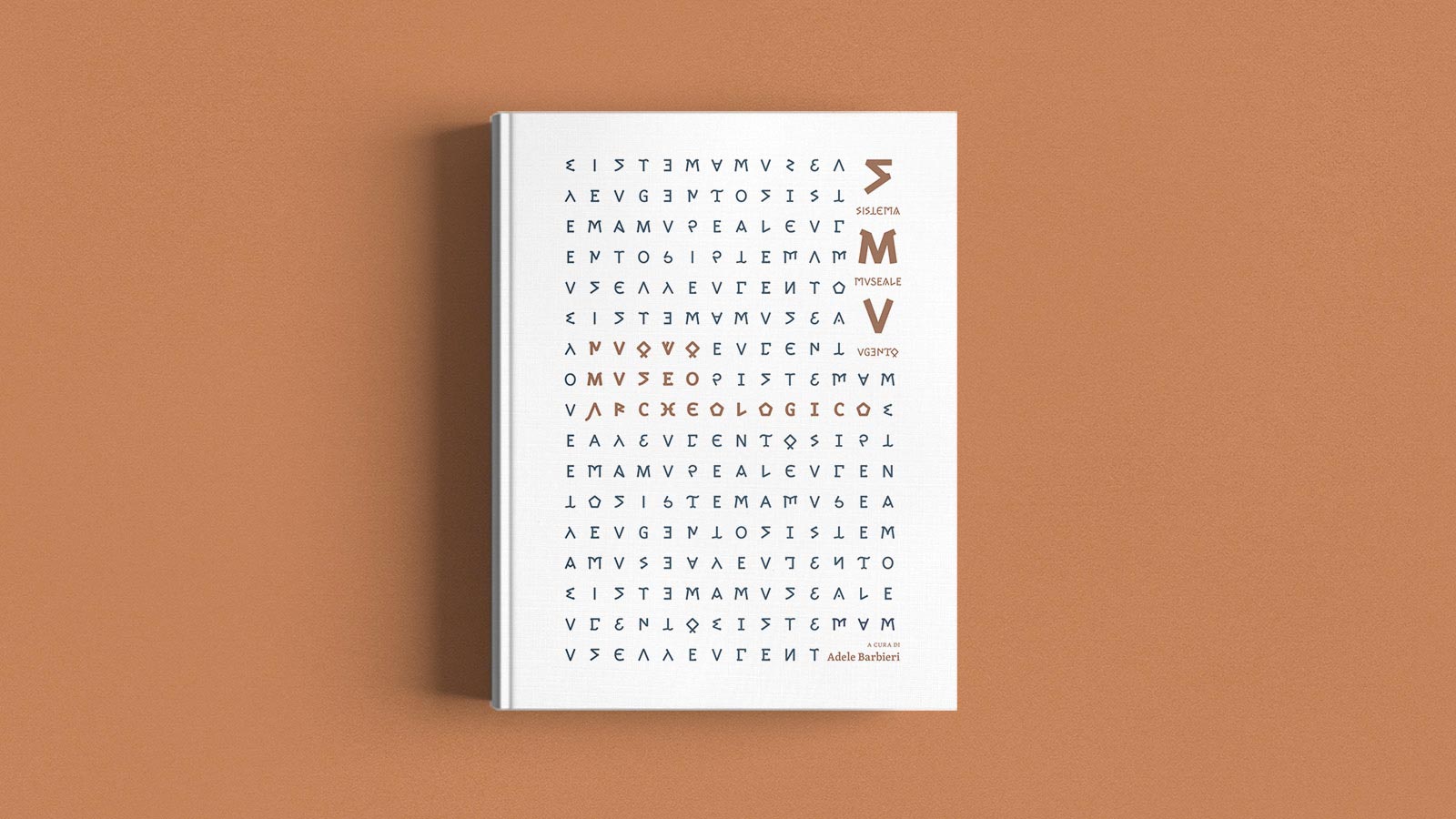
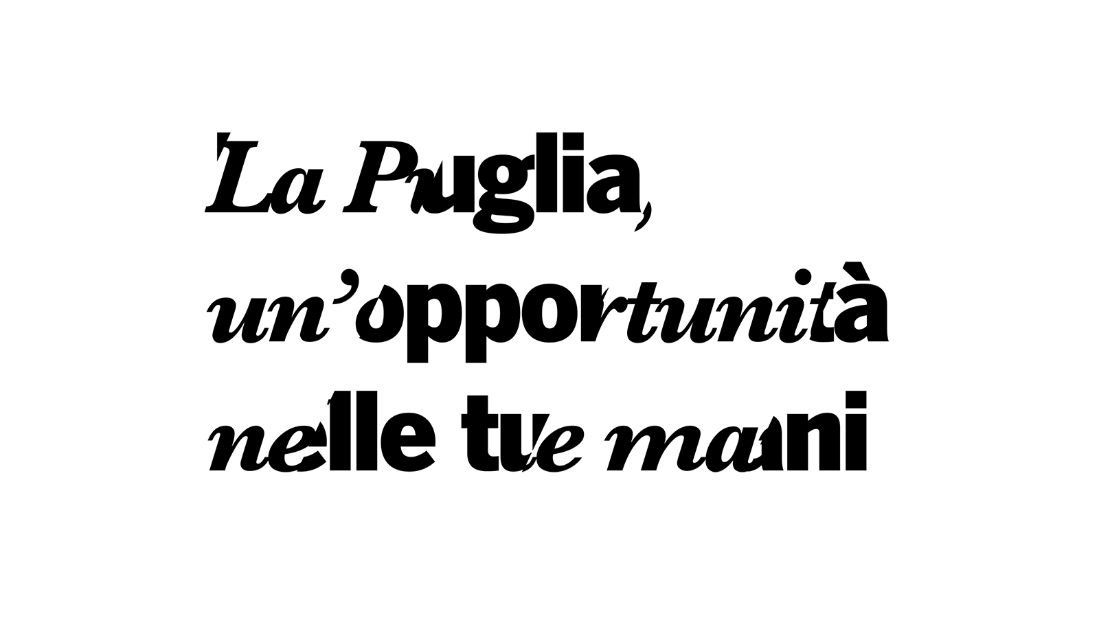
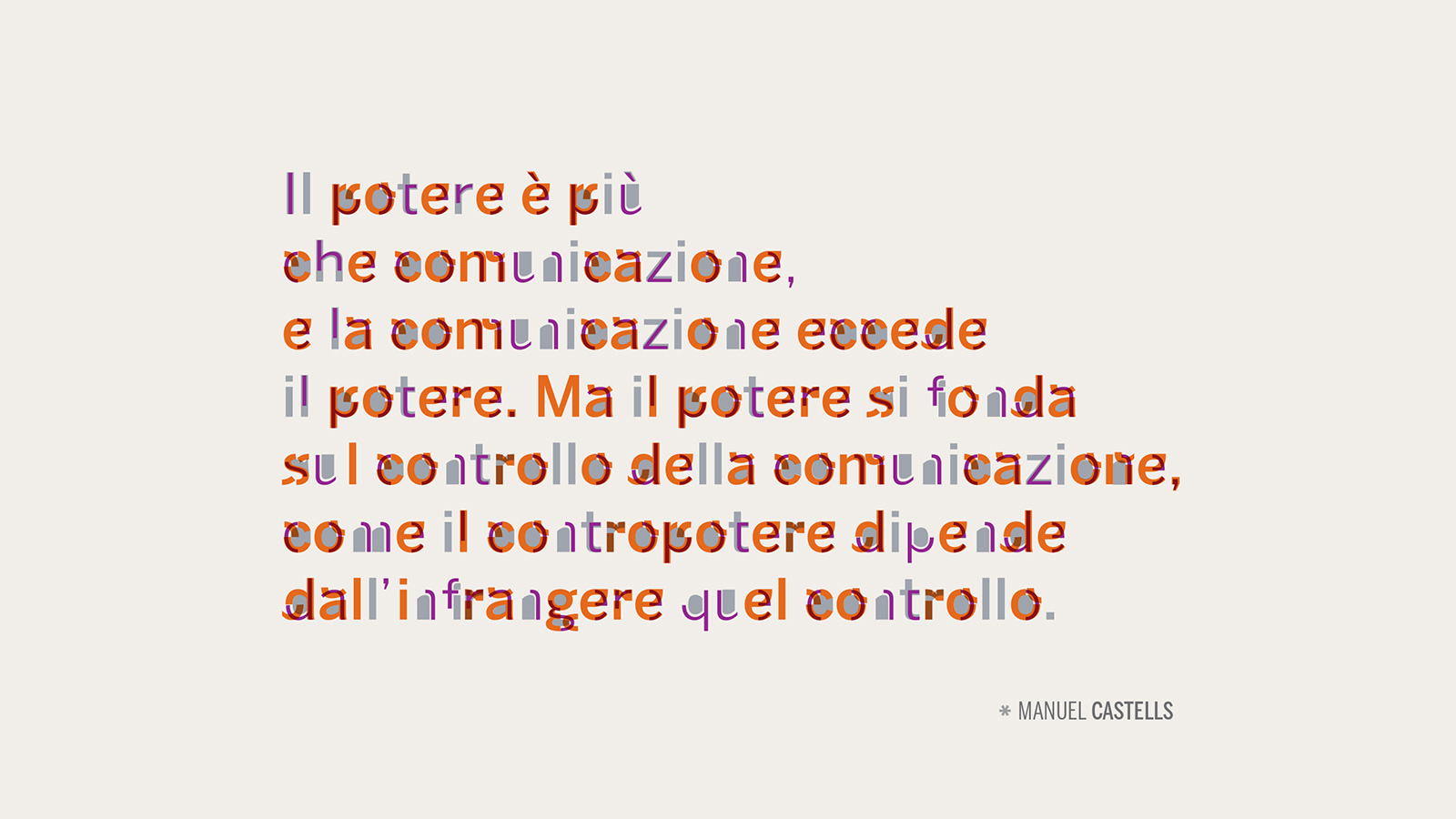
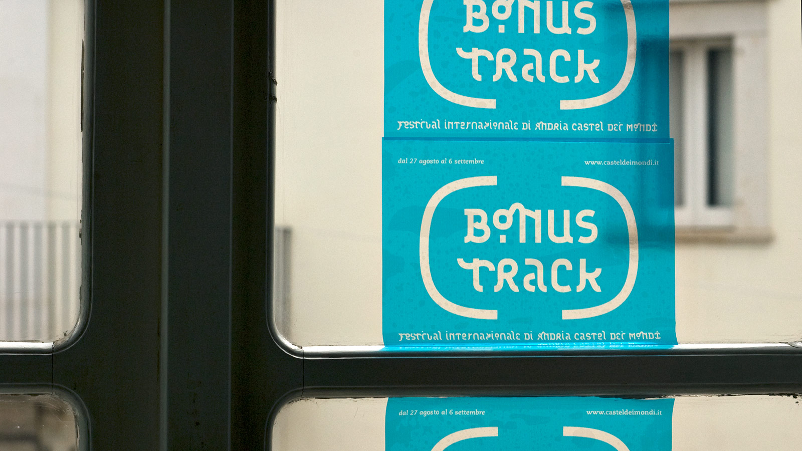
The brand identity is based on a typographical “effect for explanation”. In other words, we’ve tried to enhance and emphasize the comparison by using specific fonts, texts and visual layers.
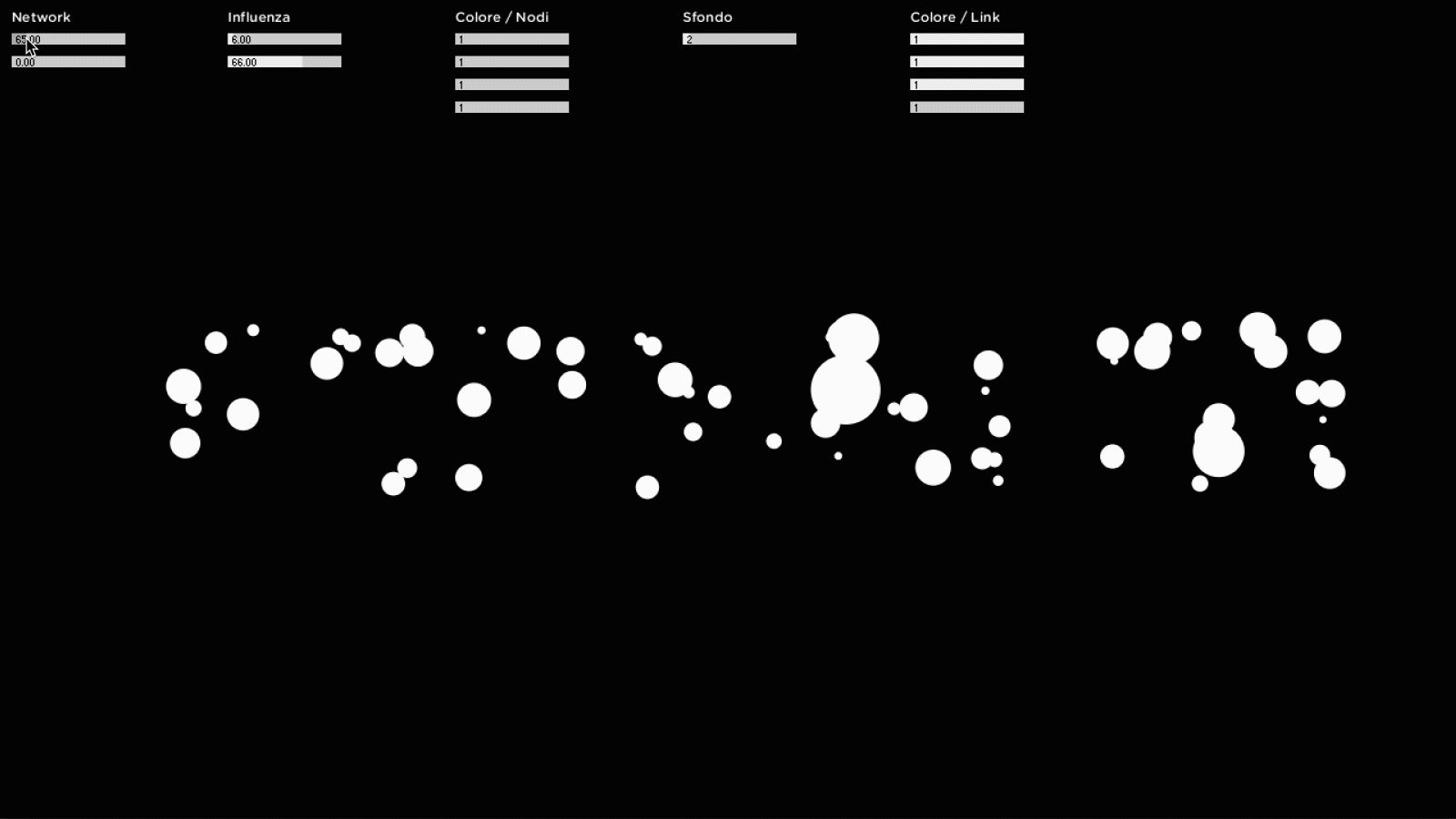
This "effect for explanation" was then translated into instructions that the computer could understand. With the processed code, we then created a parametric software that allowed us to define the communication campaign.
For instance, it will be possible to use the same "processing" on other words (useful tool for advertising, social media and billboards) or on pictograms / symbols.
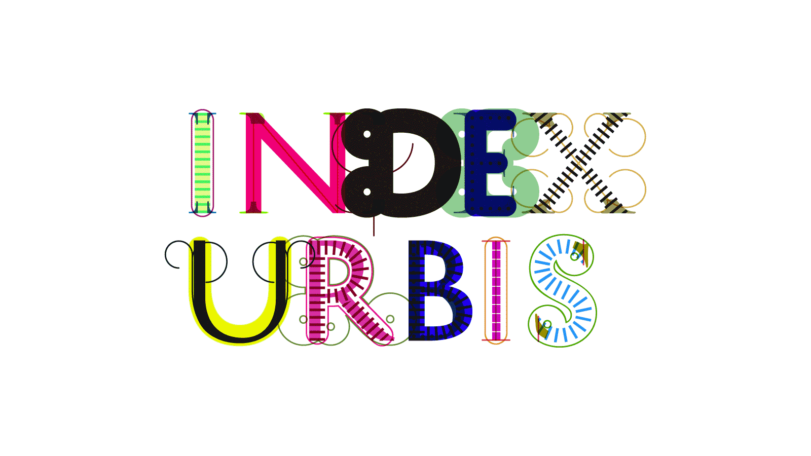
The logotype is parametric, which means that there is no "logotype", but a plurality of possible configurations, which allow us to always use it in a different manner, as if the identity "were alive".
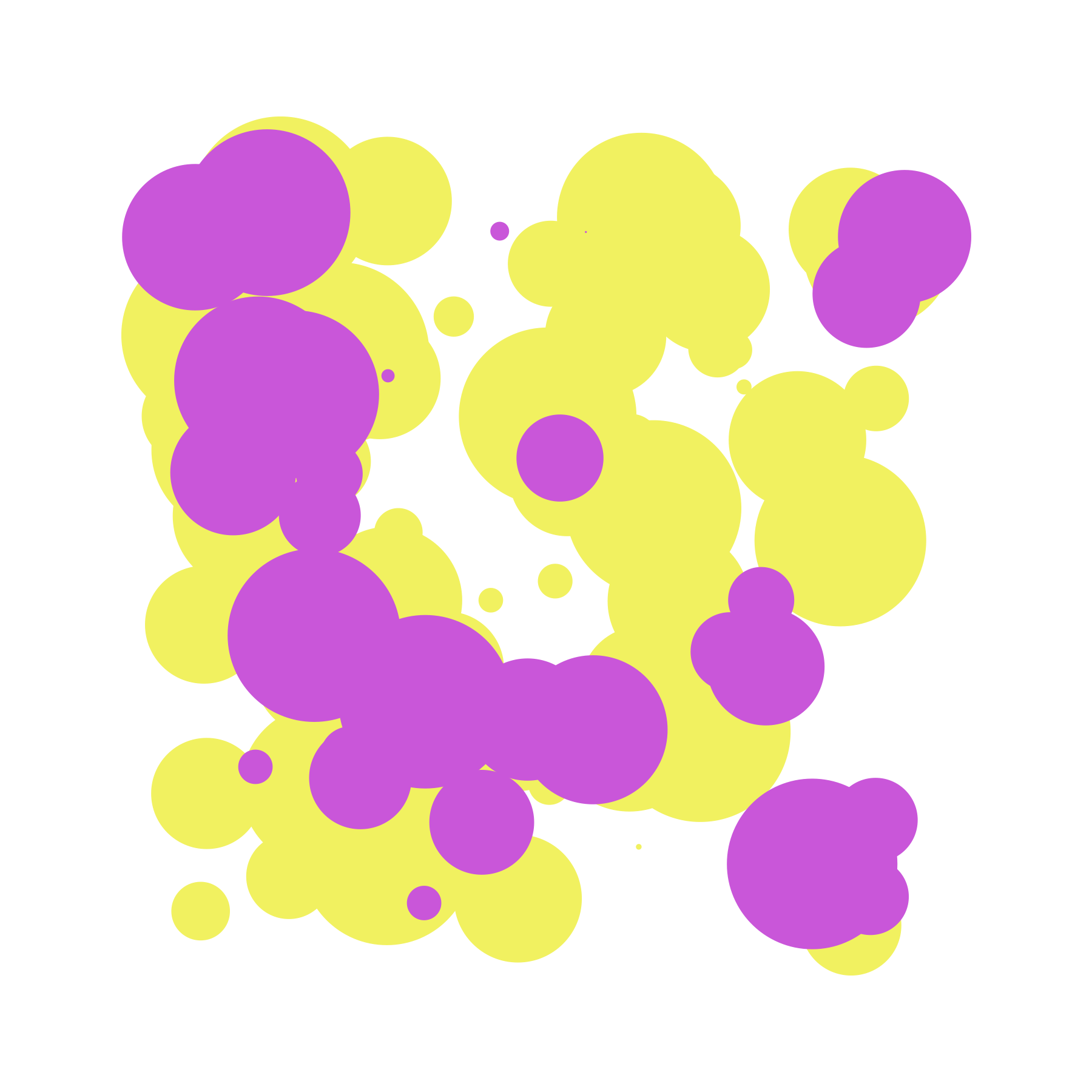
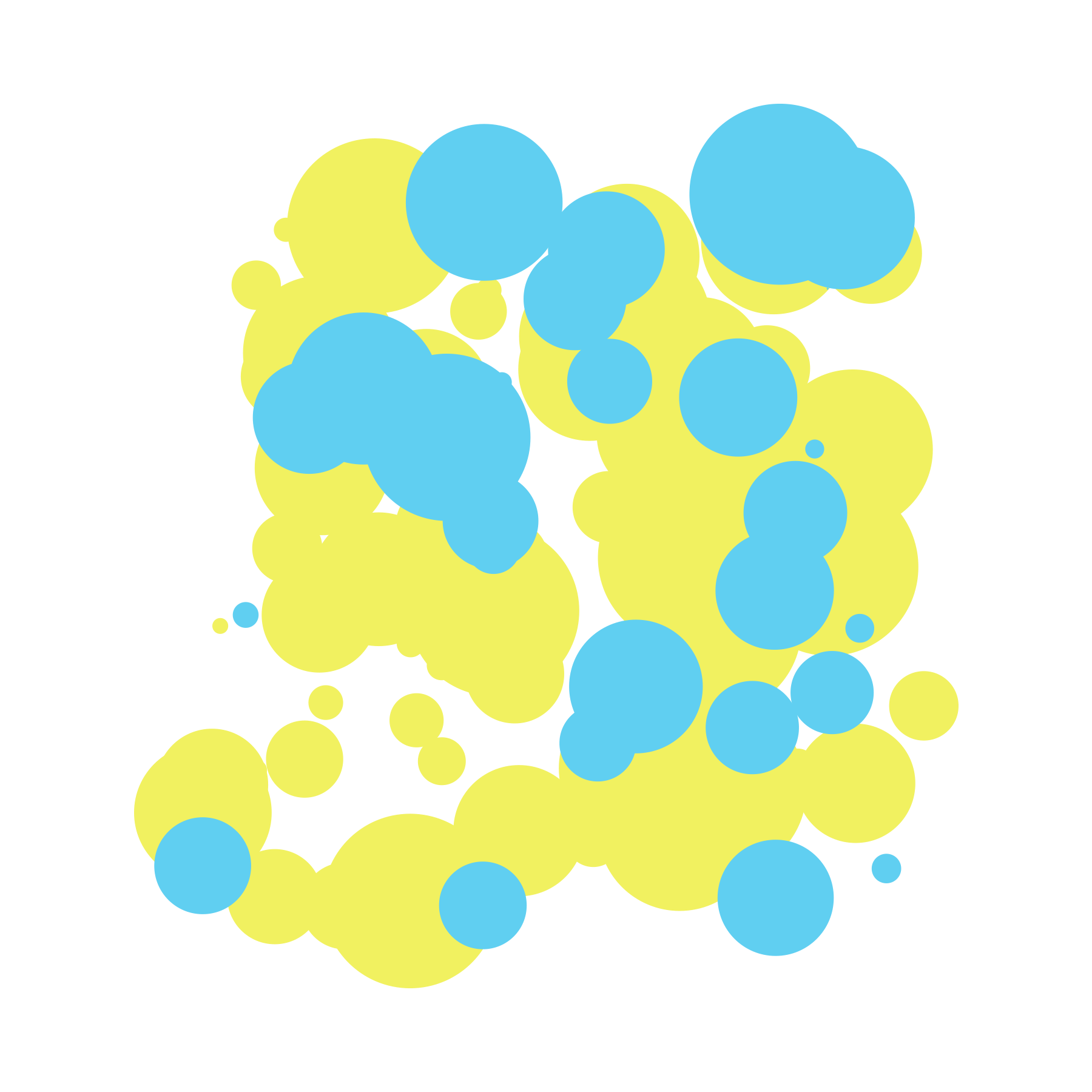
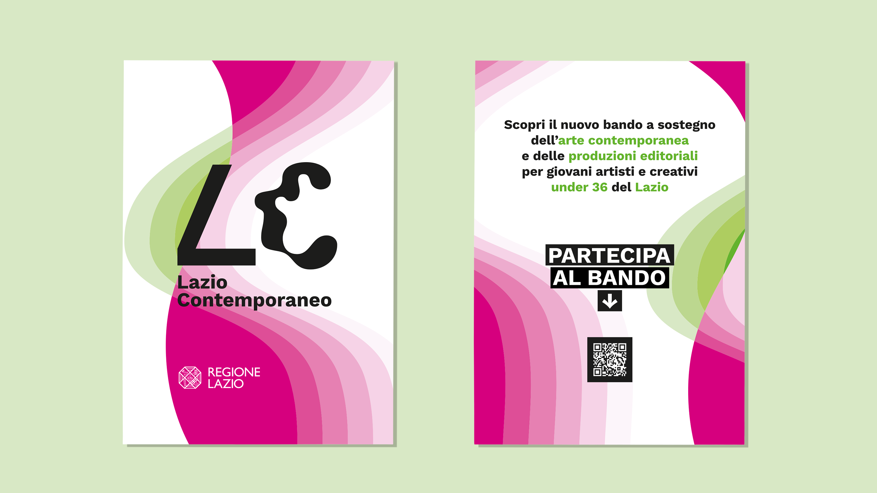
There are 5 identified colors that cover the entire spectrum of colors visible to the human eye. The chosen hues share a mutual balance.
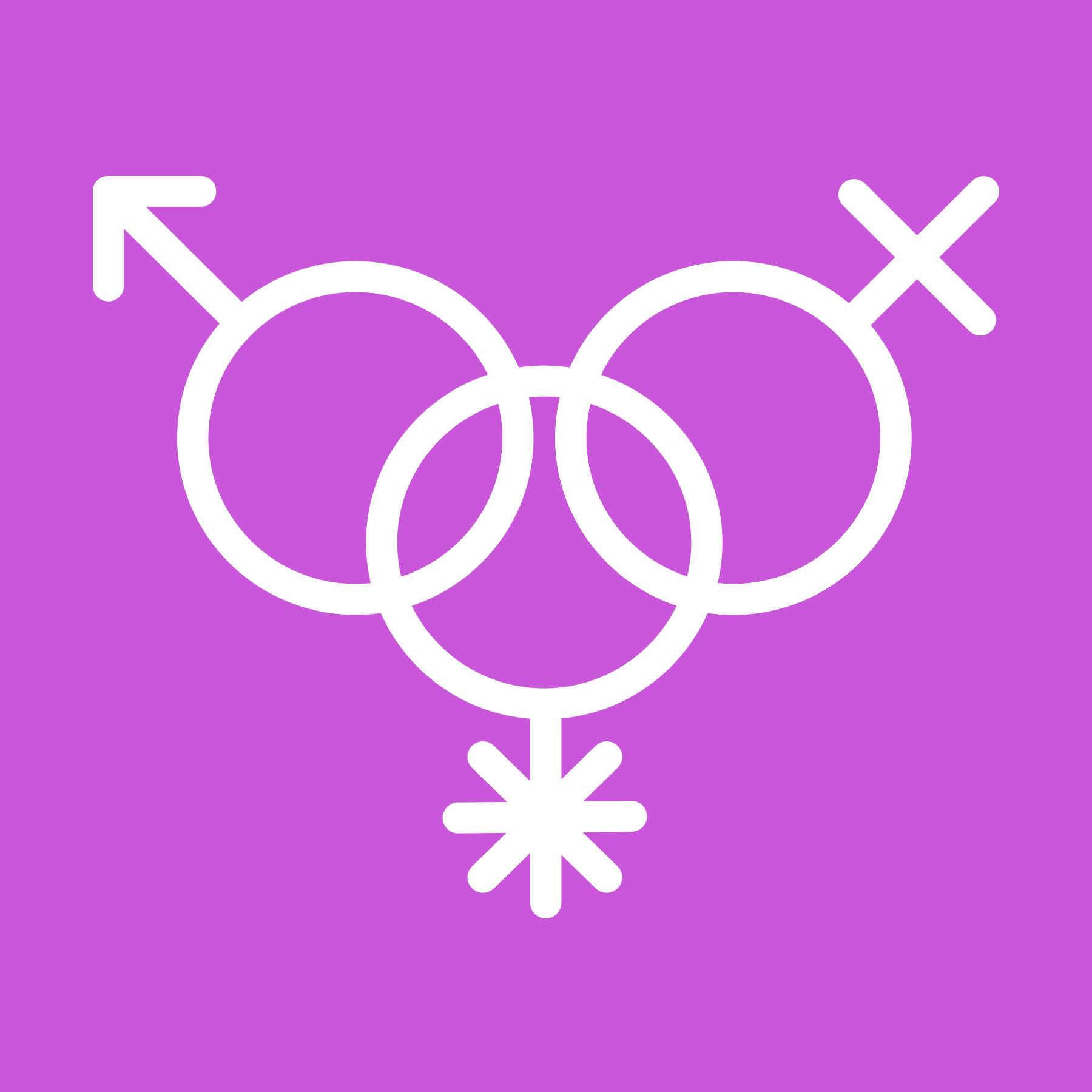
We have designed five icons to express the corresponding topics of the investment:
→ gender equality
→ inclusion and participation
→ training and culture
→ areas, environment and territory
→ welfare, wellness and health
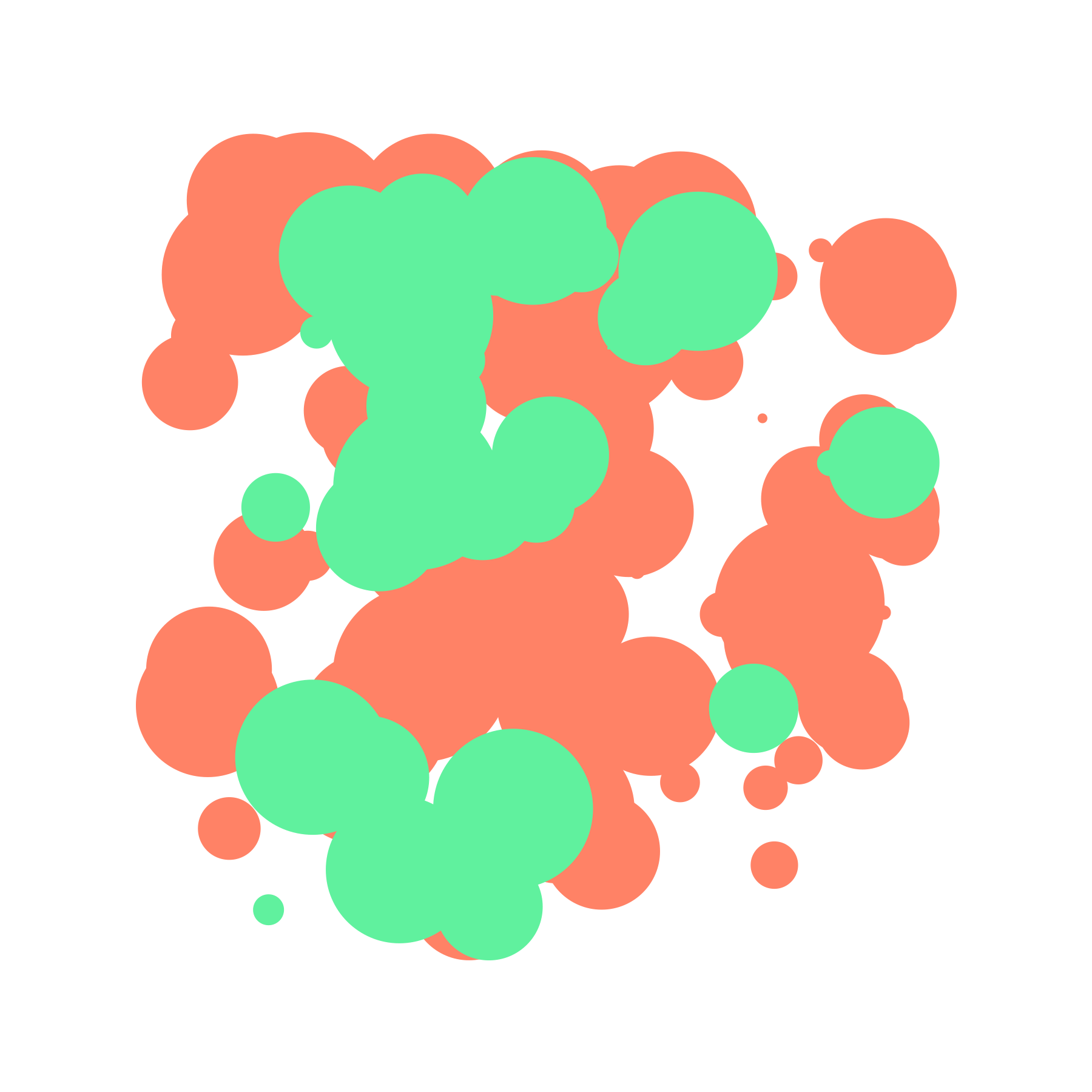
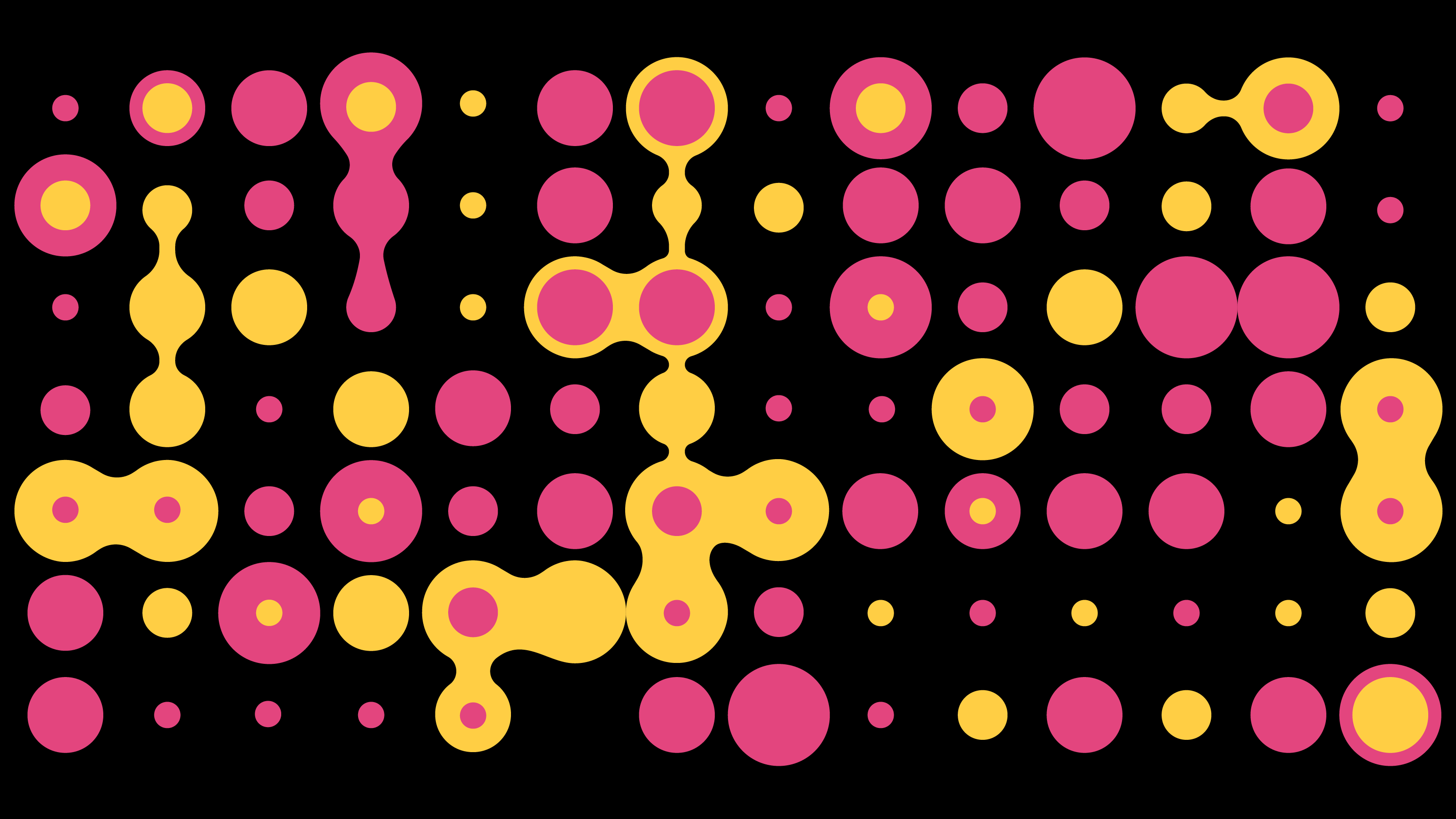
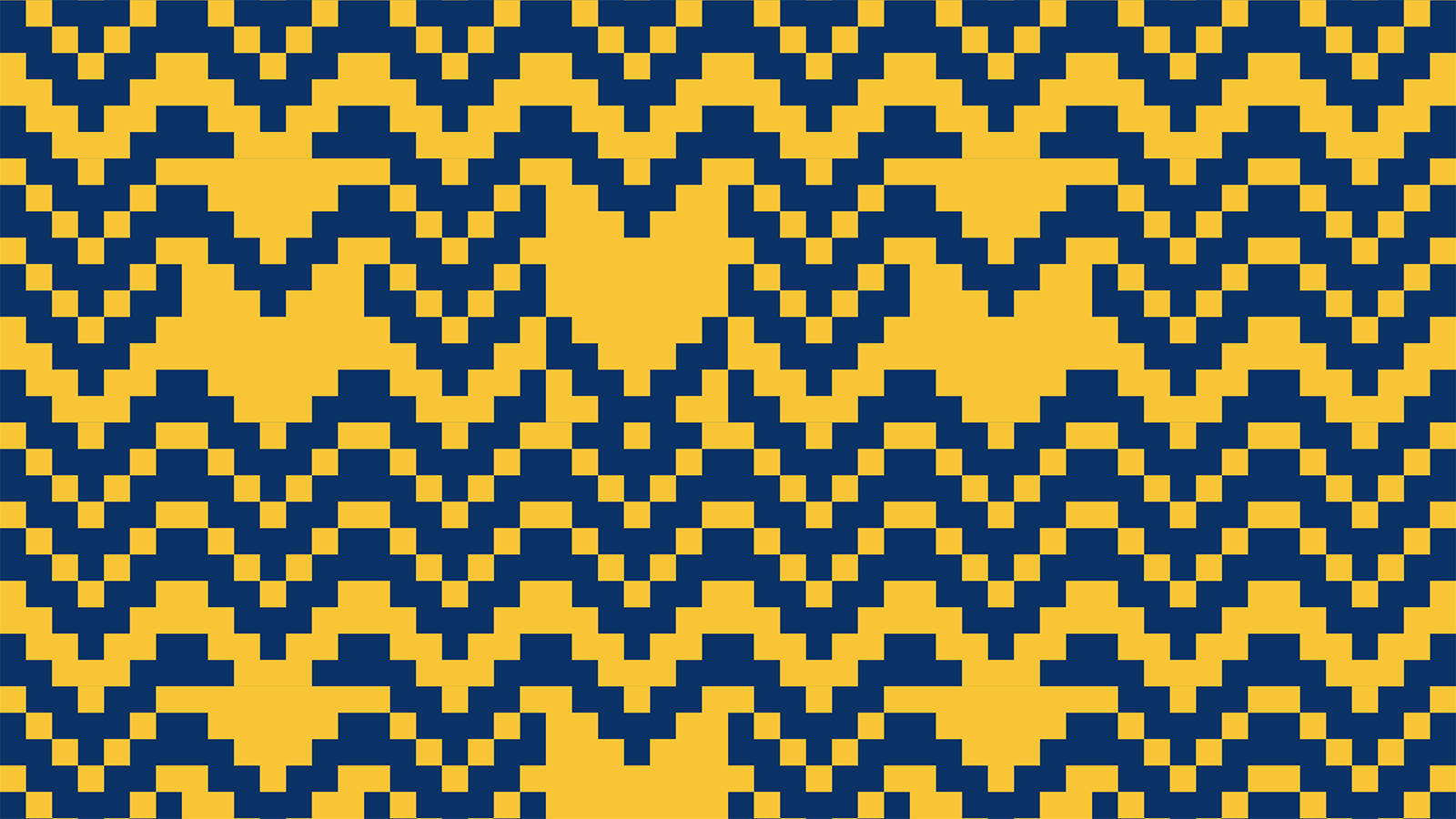
The created “effect for explanation” had also been adapted to create patterns and textures, which are crucial to develop a visual language capable of capturing the perception of the audience.
That is why we have written a second processing program, which had the same logic of the first program, but based this time however on the creation of groups of "random" elements rather than the design of vectors that describe the letters.
Textures can be printed in 2 ways:
→ solid hatch
→ soft hatch
During the communication campaign we handled the art direction of the video spot made by HubNormal Films and we managed their social media (Facebook and Instagram).